Tuesday, November 29, 2016

Christmas ATC's

The last class of the year we generally do some Christmas ATC's.  This year that's all I've done!  I have half a page of quotes that I have collected with a Christmas theme so all of the girls will have something witty (and some naughty ones too!) to use on their atc's.  The background is a simple one using Distress Ink Pads and Embossing Folders.  I love the cat and dog cubes from Stampotique stamps!

I hope everyone has a wonderful Festive Season and see you in 2017!

"Ornaments"... 

"Fleas Navidog"... (these words come as a stamp 
from the Stampotique website!)

"Ho Ho Ho"...

"On Dasher"...

These next two are from the Chalkboard & Alcohol Class.
 "Mood Swing"...

"Nightmare"...

Finally, this is one from the last class Shimmering Alcohol.
"FURniture"...

Thursday, November 17, 2016

SHIMMERING ALCOHOL

We'll be using alcohol inks once again in this class and one of the girls (thanks Jenny Jongste!) showed me her rubber puffer thing to blow the alcohol inks around instead of having to buy and use the pressurised cans of air.  These little puffer things are used for cleaning out cameras and keyboards etc and are really cheap through ebay!  They look a little like a light bulb but have a really fine nozzle on one end so when you squeeze the rubber bulb, a short sharp blast of air comes out.  Great tool!!!
So it creates these gorgeous backgrounds with the alcohol inks but on a base of silver ink and pearl white to start with, it gives the whole card a real shimmer to it, which of course you can't see on the computer screen.  You'll just have to try it for yourself.  Most people get the joke that's on the Sodium card, do you?  

"Sodium"...

"Keep still slave"... (loved the new feral kitty
stamp cube from Stampotique... it goes
perfectly with the doggy cube)

"Another world"...

So these 4 are just the backgrounds unadorned and they are in the same order as the above 3 pictures.  The last one with just the blues is incomplete as an atc so it will be on my next update.


Tuesday, November 1, 2016

CHALKBOARD & ALCOHOL

This technique is one I read about in a book about alcohol inks & yupo.  It's using a different surface for the alcohol inks to work on - chalkboard contact paper.  Like the technique where we worked on the corrugated card that had been painted black, you need to apply a white alcohol ink before applying the colours of alcohol ink as the white allows the colours to show up.  A similar technique I've used before is applying gesso over foil tape before applying alcohol inks, particularly the lighter colours of inks as the white base makes the colours pop much brighter than on just the plain foil.  The 5 samples down the bottom are the atc sized pieces without any adornment on them so you can see how the colours actually are.   Sometimes it can be quite difficult working on atc sized pieces of work for some techniques, but you just have to learn to scale everything back, in this case, the amount of product you use.... less is best!

"Wild"...

"Tangled"...

"Eyebrows"...

"Planet B"

Planet B sample.

Eyebrows sample

This is one I haven't turned into an atc yet... love the colours though!

Tangled sample

Wild sample

Friday, October 21, 2016

RUSTY CINNAMON

There are many various ways of doing a rust technique, everything from vinegar and salt, pre-prepared products, rusting items in water and leaving them in there for the naturally rusty look, right through to using other items you wouldn't even contemplate!  Hence the rust in this technique is using cinnamon for both texture and colour.  Starting out with a black base then adding some brown paint (Burnt Sienna is perfect) and maybe a little of another colour (turquoise?), then sprinkling on some ground cinnamon works perfectly!  I have sealed mine when they are dry using a matte medium but you can leave it au natural if you prefer.  Chipboard or metal works equally as well for your base substrate as both will take the colour just fine.  I find the Ranger Distress Paint is best for rusting your metal pieces as it sticks to metal and you can just use a Black Permanent marker to colour in the chipboard pieces as it is instantly dry and ready to use.

"Heart...

"Trapped"...

"Artifact"...

"Superficial"...

"I rant"...

"Live a life"...


This one below is obviously not a rusty piece but one of the samples from the last set of classes using the corrugated card and chipboard, Corrugated Layered ATC's.  Yes I know, there is some pink on it, generally so not me but it works well with the green colour so what the heck!

"Some birds"...

Thursday, October 6, 2016

CORRUGATED LAYERED ATC'S

This class utilises the thicker corrugated cardboard as the background and then other chipboard layers are added on top of this.  Each piece is painted with black gesso (or black acrylic paint if you don't have black gesso) and then assembled.  To attach the chipboard or laser-cut pieces you can use gel medium, glossy accents, good quality double-sided tape if your piece allows for it or as in the case with the wrought iron fence below, staples!  Then a white spray is used, either Dylusions White Linen or Ranger Distress Spray Stain Picket Fence and either while wet or allow to dry, add additional colours.  I've tried to stick to only one other colour or at the most two as these pieces are atc's (2-1/2" x 3-1/2" in size), you can easily muddy the colours if you use too many.  Then other embellishments, wording etc are added.  A bit of a fiddly technique but I love the dimension of these atc's!

"Unpleasant Dreams"...

"Fragile"...

Gardeners"...

"Seeker"...

Friday, September 9, 2016

MONO PRINTING

Mono printing is so typical of many forms of making backgrounds in that you generally get "one go" at it and if you try and repeat the exact same thing, it never works out.  I'm thinking alcohol inks particularly here!!!  You can use the same colours as previously, think you are doing the same movements or application but nope, it just doesn't look the same.  So mono printing is named as it's a single print.  I used a combination of acrylic paints (Jo Sonja work just fine) and some of the various metallic paints that are around, love the Plaid ones!  I also used stencils to add interest and even the humble bubble-wrap makes circular marks in the paint layer before you lay down the card.  I've used both smooth watercolour card as well as a heavier weight gloss card as they both work but give different looks to the backgrounds (which of course you can't see on the computer).  I love background classes.

"Vampires"... (no stencil works just fine)

"Landscape Painting"... (a beautiful lattice type stencil was used on this one)

"Bee fierce"... (I used a hexagon shape stencil on this background)

"Little sparkle"... (this one has the bubble wrap on the background)

This gives you a better idea of how they turn out.

...and more.

Friday, August 26, 2016

FOAM CORE BOARD EMBELLISHMENTS

Foam core board can be bought in all different sizes, from A4 size right through to big sheets that are 100cm x 800cm!  It was this size that I bought so I could cut it down to A4 size for the girls so they could have enough to have a good play with this product.  Not only can you just cut it with scissors, you can also run it through a die-cutting machine (like the Big Shot or Cuttlebug).  The only thing you need to remember is that you need to use the normal size cutting dies to cut with as the thinner sizzlet or wafer thin type ones won't work as they don't cut deep enough.  Any of your older big or thicker dies work perfectly and it surprisingly keeps a decent amount of height to it and doesn't flatten out like you would expect it to!  You can also emboss with them too though you may need to muck around with the sandwich layers to work out what will be the correct combination without trying to force your machine.  It does do a really good impression though with the embossing folders!

Because this product is so soft it's easy to make cuts into it or poke holes in it to push brads through (as shown below) and takes paint and sprays and whatever other colouring method you wish to choose.  I simply stick mine down with double-sided tape as it's not heavy at all, not much weightier than a piece of paper in fact.


"Editing"...
(a long strip of foam core board
that has been cut into blocks)

"Rustic Spirit"...
(The ironworks border die run 
through my Big Shot)

"Seduction"...
(A heart that I cut out freehand
and then cut some slashes in so
when it was painted and dry, I
could drop in some gems that were
glued in with glossy accents)

"Sparkle"...
(The daisy  -  or as I call it "the splat" die)

"Broken Crayons"...
(Brick blocks that are quite
dimensional in height)

Tuesday, August 9, 2016

ELEGANT WRITER PEN CLASS

Firstly let me state that I am not an artist as the following pictures will attest!  I googled "simple line drawings" to get some ideas and just drew.  So if you're actually an artist, do try this pen as it's watercolouring possibilities are beautiful!

The Elegant Writer Calligraphy pen has the unique quality that it bleeds beautiful greys, pinks and mauve's when wet with water.  As I work on atc's which are small (2.5" x 3.5" or 6.4cm x 8.9cm), it can be quite a challenge to get much detail happening.  If you google Elegant Writer Drawings you'll see some absolutely amazing artwork that people product and they are all bigger than atc's!  So to work so small you need not much detail and more open areas to do the washes using an aqua brush or fine paint brush dipped in water.  

Some of the ones below I have then added colour after using Twinkling H2O's which are great for adding just a wash of colour to complement the grey etc that the Elegant Writer gives with just water.  If you blot almost immediately with a paper towel when you activate the line of the Elegant Writer pen, you'll get more of a colour change, this is when the pink and mauve colours show up.  Also I have heard that as the pen gets older and more used it is not so black to start with so that also alters the colours that it will bleed.  

I've also included down the bottom a drawing that I've done using just the pen with no water added (Dogs speak) and also some with the pen and just water, no other colours to give you an idea of how subtle the other pinks and mauve's are.

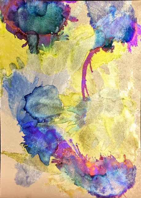
"Trees"... (I used Twinkling H2O's in
a pink and a purple to add
extra colour to this one)

"Falling"... (this one also has Twinkling H2O's, blue 
for the sky, a little gold down the bottom, brown on the 
branch and green on the leaves.)

"Dark side"... (Once again Twinkling H2O's 
in red and pearl for this one.)

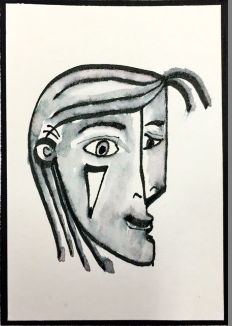
"Wear my hair"... (No other colours on
this one at all, just the pen and water.  Like I said,
I'm not artist and this started out as a
girl and morphed into a man!)

"Dogs speak"... (This one has the dog and the speech
bubble drawn in the pen but no water added yet, he also needs
his teeth drawn in when the watercolouring bit has
been done.  You can go back and add details with a
permanent pen after it's dry!)

This is one of Tim's birds from the Ranger stamp set and
I wanted to show the girls you could actually stamp using a
pale grey ink pad, I used the Dove
Grey in Stazon but any pale grey waterproof ink pad would
work.  Then draw over the lines with the Elegant Writer
pen and colour in using the water!

This one also is just water.

Water only.

Water again.  This shows the pinks and mauve's well