Showing posts with label Acrylic Inks on Photo Paper. Show all posts

Wednesday, August 28, 2024

ACRYLIC INKS/DISTRESS RE-INKERS ON PHOTO PAPER

I have used acrylic inks before on photo paper and had forgotten just how vibrant these fluid inks can be on the shiny side of the photo paper. The contrast between the beautiful magenta one at the top and the next one with the black bird die-cuts shows you can also create a more subtle background. The one with the black birds is Winsor & Newton Silver Acrylic Ink and Liquitex Burnt Sienna, a gorgeous combination and silver in real life is stunning! 
Down the bottom of this post is an image of the backgrounds I made using my Distress Re-inkers. These work just as well but take a bit more time to dry. No heat gun was used to dry any of these as the photo paper will blister so you just need some patience and let them sit while you create more gorgeous backgrounds. Black Stazon is your best stamping ink if you want to stamp. Rub-ons also work perfectly on these backgrounds. I used rub-ons on both of the samples with the magenta.

"State of mind"


"Scenic route"


"Fearless"


"Field notes"


"Make today count"


"Keep moving forward"


These backgrounds were made in the same way as the ones above 
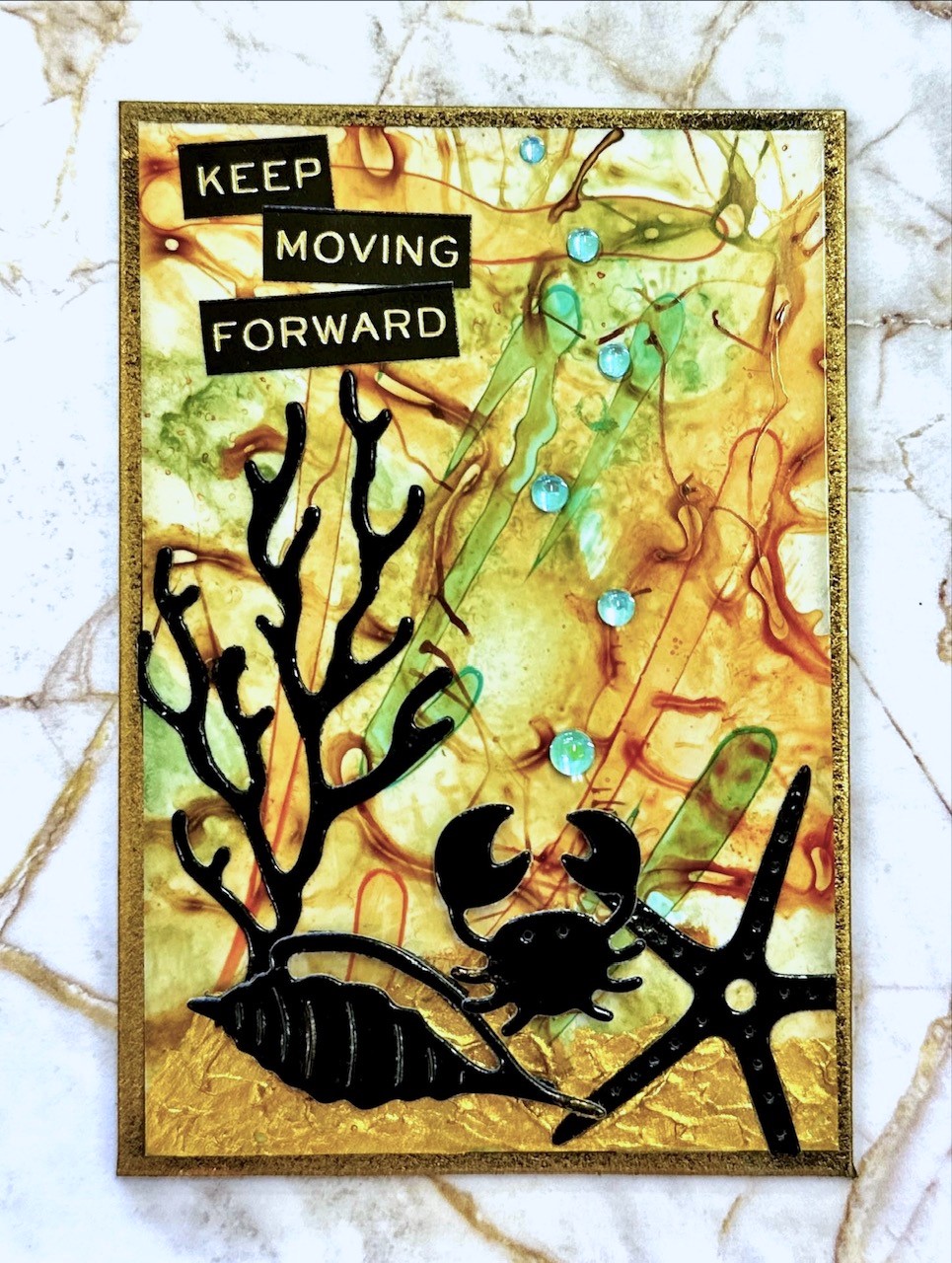
but they were created with Distress Re-inkers instead of Acrylic
Inks. They took longer to dry but they still are very cool backgrounds.

Wednesday, March 30, 2022

ACRYLIC INKS ON PHOTO PAPER

 This is another use for the amazing Acrylic Inks that are made by various companies. For my samples, I used the Liquitex ones exclusively this time. I found the metallics didn't spread as well as the normal inks but are ok when used as an accent. For the substrate, I used Kirkland Photo Paper and yes, I used both sides because they give very different results! I think I love the black ones the best and don't ask me how I got the 2 moons in the first example below, I have no idea as it was one of those happy accidents that you just run with.

"Not what they seem"


"No angel"


"No possible escape"
(You can see the metallic copper on this one doesn't spread
like the other normal colours do, but it's ok as a secondary
accent colour)


"Aquaholic"
(I loved how this one looked like water splashing up!)


"Just another insect"
(This is the back side of the photo paper, it gives
a very different look to the glossy front of the photo paper)


"Mood: nah"
(Another one where I used the back of the photo paper)


"Today is the tomorrow"


"Life looks better"


Finally, a card that I made using one of the atc
samples from this technique to use on a card instead
of an atc.  In each class, I try to make a card to
build up my card stash using one of my atc's 
from every technique.