Friday, December 5, 2014

PERFECT PEARLS RAINBOW EFFECTS

Coming up this fortnight is the final technique for 2014, Perfect Pearls Rainbow Effects.  Another use for Perfect Pearls so that makes it 3 PP classes in a row!  This class uses only the one colour though, the white one called Perfect Pearl.  When it is mixed with water it makes a shimmery spray that can be spritzed onto a card that has been embossed with either black or white stamps, then coloured using Distress Ink Pads (make sure they are juicy as you need a lot of colour to stop it from washing off when you spray).   It gives the card a lovely shimmery finish that is very subtle and can only be seen when the card is tilted towards the light.  It certainly adds something extra to the beautiful colours of the Distress Ink backgrounds! 
Once again, you can't see the shimmer in the samples below, so you'll just have to mix some up for yourself and try it out.  Just a hint  -  contrasting colours of Distress Inks work best as opposed to colours that are too similar.  You want the colours to run and bleed into each other, it will look too much the same colour unless there is some sort of contrast.
 
"Jingle"...
 
"Canvas"...
 
"Twilight"...
 
"Seriously"...

 
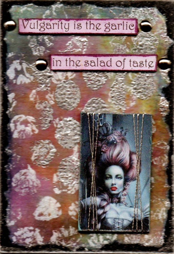
Finally the last sample from the Perfect Pearls Suede class from last fortnight. 
 Love the colour combination in this one!
 
"Memory"...
 
Wishing everyone a wonderful Christmas season and I'll be back in January 2015!

Tuesday, November 18, 2014

PERFECT PEARLS SUEDE

UPDATED 21/11/14 - NEW PICS BELOW
 
Here are another couple of samples for this class...
 
"Canvas"...
 
"Silence"...
 
 
To give the girls a bit more Perfect Pearls fun, the technique for this fortnight is Perfect Pearls Suede background that uses a combination of Glycerine and Distilled Water to make your own Ink Refresher (120ml distilled water to 5ml glycerine).  You spray this mixture onto black card stock, rub it in then while still wet, scrunch up your black card stock to create lots of creases.  Smooth out slightly then brush on Perfect Pearls all over the damp background.  Rub in with the brush that comes with the PP's and brush off the excess.  You don't need to set this with water as you worked onto a damp piece of card to start with.  These create beautifully, soft and shimmery backgrounds.  Of course, the computer screen doesn't do this technique justice so you'll just have to try this one out also.   Anything that has shimmer to it needs to be seen in real life to appreciate how wonderful it looks!  I've only had time to create two samples so far this week but plan to put some more up on Friday so check back in a few days and there should be more examples.
 
"As we are"...
 
"Imagination"...
 
This one below is the final sample from the last class, also using Perfect Pearls and once again, you can't see the Perfect Pearls.  The whole atc is an image and the ghostly woman had a white shimmer around her initially which I further enhanced by applying some clear embossing ink only over her image using my finger, then I brushed on Perfect Pearls in the white colour, called Perfect Pearl!  When you tilt the card to the light, the woman shimmers with a pearlised sheen.
 
"Dreamscape"...

Tuesday, November 4, 2014

Perfect Pearls Revisited

Perfect Pearls are a Ranger product that is a form of shimmery mica powder.  It can be dry-brushed onto a clear embossed stamped image on dark coloured card stock (as in "Psychodrama" below), or it can be used with a wet paint-brush to make a translucent paint for either colouring in stamped images or creating a background.  It does need water to set it so if you use it as a paint, the water is already added but if you dry-brush it into clear embossing, you'll need to spritz very lightly with water so it doesn't rub off.  It's virtually impossible to see how shimmery this powder is on a computer screen and in the card below "Seize the Night", you can't even see the powder at all until you tilt it so it catches the light, which obviously you can't do on the computer!   For that one, I stamped the image using Ranger Archival black onto a pre-coloured background, then using my finger, applied some Versamark (clear embossing ink) on various parts of the image, then dry-brushed the Interference Green Perfect Pearls and set it with water.  When you tilt this card you can see the green shimmer.  Great for ghostly effects!!!
 
"Dresses to Kill"... (image coloured in with Perfect Pearls)
 
"Medicated"... (hair only coloured in
with Perfect Pearls, gorgeous turquoise colour!!!)
 
"Seize the Night"... (Dry-brushed Perfect Pearls on various
parts of the image)
 
"Psychodrama"... (Stamped image with Versamark clear embossing
ink and then dry-brushed various colours of Perfect Pearls on to image. 
Also coloured in background with Perfect Pearls with a little water)

 
This one below is the final atc from the previous class - Sanitized Alcohol Inks.  The girls did a great job with their atc's in this class, so many different colour variations and effects were created!
 
"Stay Calm"...


Friday, October 24, 2014

SANITIZED ALCOHOL INKS

Alcohol Inks are a favourite product of most people who have them but it's always interesting to see how else you can use them besides the usual pouncing motion using a piece of felt on an applicator on gloss card.  This particular technique uses hand sanitizer gel as the carrier to spread and blend the alcohol inks instead of the normal blending solution that you use for gloss card.  Also, I have done this technique on plain white matte card instead of gloss.  I don't generally like the effect of alcohol inks on matte card using blending solution as it seems to be a bit dull, but this technique using the hand sanitizer gel seems to get a better and different effect than you normally would using the standard method of application described above.  How?... A small puddle of hand sanitizer gel on a non-stick craft sheet, drop in a few drops of a couple of alcohol ink colours, blend slightly and then press the card in to pick up the colour of the ink and the hand gel.  Re-press if more colour is required and allow to dry naturally and yes, the hand gel just disappears!   I just had a thought as I was typing this, I haven't tried the metallic alcohol inks with this method but I will tomorrow at my first class and see how they perform as well!  More results later.
 
"Aviator"...
 
"Shopping fool"...
 
"Transform"...
 
"Damaged"...
 
I thought I'd show you the stripe effect you can get with this technique.  A very different look than normal alcohol inks and yes, it's on matte card stock!

Tuesday, October 7, 2014

EMBOSSING POWDER MIXES

Embossing powders are a staple in any stamper's diet but they tend to be something that is used for a bit, then put aside and forgotten about.  I love how with a few basic colours plus a few extra's, you can make a whole new batch of beautiful embossing powder mixes to co-ordinate with any project that you happen to be working on.  Of course most people have the standards, gold, silver, black, white, copper and clear... but add a few colours as well, blue, orange, brown, teal, red etc., mix a few together (writing the recipe down as you go of course!) and you have a whole new range.  I love covering pieces of chipboard totally with embossing powder and using as a frame (as in the first two samples below) or to use as a base to mount words on (as in the third one) or simply emboss a gorgeous shape and let it speak for itself.
 
"Without art"...
 
"Delicate"...
 
"Mystical"...
 
"Fashion Taste"...
 
Below are some embossing recipes that I have made up for this particular class.  If you go to "labels" down on the right hand side, you will see a heading "Embossing Powder Recipes" where you will find my earlier embossing powder mixes.  The word "part" means your measurement.  The little spoons that come with the meals on plane rides are great, or you can simply use a pop stick to measure.
 
Granite:  5 parts black, 1 part white, 1 part silver
Old Copper:  3 parts copper, 1½ parts green, 1 part pewter (or silver)
Old Gold:  2 parts gold, 1 part copper, ½ part apricot (orange)
Patina Brown:  2 parts gold, 1 part chestnut (brown)
Patina Azure:  1½ part black UTEE, 1 part black, 1 part aqua
Verdigris:  5 parts black, 2 parts gold, 2 parts powder (light blue), 1 part aqua
Weathered Green:  2 parts green, 1 part black UTEE, 1 part silver
Weathered Orange:  2 parts black UTEE, 2 parts apricot (orange), 1 part copper, 1 part black
 
This one below is the final sample from the previous class, Metallic Paint Scrape.
 
"Maladjusted"...

Friday, September 26, 2014

METALLIC PAINT SCRAPE

Our ATC class technique for this fortnight is a background technique that can be treated in a couple of different ways to create a different finished effect.   I used Plaid Folkart Metallic Paints scraped on with a credit card to plain card stock to begin with.  It dries very quickly as you're only applying a thin layer of paint.  Now comes the decision as to what to do.... you can either stamp straight onto the dry painted background using either Ranger Archival Ink or Black Stazon Ink to get the stamped finish or you can skip the stamping and emboss the background so you can add an image to the background instead of the stamping.  Now there is a further step in here that you won't be able to see on the computer screen, but when the girls come to my class, they'll see the difference!  
 
If you have chosen to stamp your images, after the stamping has dried (mere seconds), cover the entire surface with clear embossing ink and then clear embossing powder, melt the clear embossing powder and you'll have a very smooth, glass-like finish.  To do the embossed style - "Choose Wisely" (through an embossing machine with an embossing folder), after the paint has dried simply do the clear embossing steps then when it has cooled, run it through the embossing folder.  This makes a very shiny glass-like surface with the added texture of the embossing folder. 
 
Now to further confuse the issue, I also did a little embossing with some coloured embossing powder.  After the clear embossing has dried, re-heat a little section where you want the coloured embossing powder to go, then tip on a little coloured embossing powder (I used copper in this first one below, "exact change").  Make sure you have some clear embossing ink on your chosen embellishment stamp and then re-heat the coloured embossing and when it's melted, quickly press your stamp into the melted embossing powder, allow to cool and lift off your stamp and you should have a nice impression of the stamped image.  Of course, this only works with the red rubber stamps, don't go using your clear polymer stamps, I couldn't guarantee they won't be affected by the high heat of the melted embossing powder!!! 
 
"Exact Change"...
 
"Not a thing"...
 
"Journey"...

"Visage"...
 
"Choose wisely"...
 
"Mesmerize"...
 
 
Finally, here are the remaining samples of the previous technique, Bubble Wrap Stamp.
 
"Perfection"...
 
"Irresistible"...
 
"Vulgarity"...

Tuesday, September 9, 2014

BUBBLE WRAP STAMPING

The technique this fortnight is a way to add further interest and texture to some background papers that you may already have and you think they just need a little something more.  Bubble wrap gives a great distressed type of printing or stamping as it's not as precise as using a specific bubble wrap stamp.  Some of the bubbles may have been popped or your bubble wrap might not be as puffy as other pieces and it also comes in different sizes of bubbles!  
 
To create this effect, I used an empty cardboard toilet roll, or alternatively you can cut an empty cardboard paper towel roll in half so you can get two, then attach the bubble wrap around the roll using double sided tape and apply paint sparingly and roll and roll along your background.  It's as quick and easy as that!   I used Distress Paint on mine but you can also use Gesso or ordinary acrylic paint applied with a paint brush.  I used a separate bubble wrap roll that I made to use exclusively with clear embossing ink,  applied the embossing ink sparingly once again, rolled that along the background and tipped on embossing powder, shook off the excess and heated.  You can of course do the paint step first, dry it and then do the embossing step to get a different look.
 
"Right decision"... (Seedless Preserve Distress Paint and a turquoise
embossing powder)
 
"Pain passes"... (Spiced Marmalade Distress Paint dried first, then Fired Brick
Distress Paint coated in clear embossing powder)
 
"Own wings"... (Picket Fence - white - Distress Paint dried then
clear embossing ink and silver embossing powder)
 
Here are a couple of backgrounds to show the random effect of the bubble wrap.

 
Below are the remaining samples from the last class, Distress Emboss Resist.  I thought I'd show you what the backgrounds look like with just the crayon resist before adding anything further to it.... love these backgrounds!  Almost too good to do anything else to them!
 
"Ecstasy"...
 
Samples...
 
Samples


Saturday, August 30, 2014

Distress Emboss Resist

This technique uses a few old favourites.... white crayon to act as a resist, Distress Ink Pads and the myriad of wonderful embossing folders!  All are created on a plain white card stock and the crayon being waxy, will resist the application of the Distress Inks.  I found an open style of embossing folder with blank areas probably work the best for this technique.
 
"Educated Weed"...

"Officially Unfair"...
 
"Observe"...

"Disguise"... (recognise the
Washi Tape feather we made
a few classes ago?)
 
"Avant-garde"...
 
Here are the remaining atc's from the previous class, Wrinkle Distress".
 
"Self-expression"...
 "Exotic"... (love the colours in this one!)
 
"Confused"...