Tuesday, May 31, 2016

PLAYING CARD ATC'S

I SO love my Stampotique stamps and I particularly love the range from Daniel Torrente and Jill Penney who design for Stampotique.  Recently on the Stampotique Facebook page there was a post with some playing cards made using the playing card background and some of the Stampotique stamps.  I couldn't use the background stamp from Stampotique because it's too large for an atc so no good for my classes so I cut out a template and improvised!   I think these turned out quite well for such little colour used on them.

Of course, you could always colour in your images but I like the clean look that imitates playing cards using mainly black, white and red (with maybe a little bling thrown in for good measure).  You need to mask off the bottom half of the card to do this technique but that's no big deal and I also made sure I printed out some good card playing quotes for my girls to use as well!

"Such a card"...

"A full deck"...

"Jack"...

"Play your cards right"...

"Drama Queen"...

Tuesday, May 17, 2016

DIE-CUT RESIST

 When I was in the United States recently I bought a couple of boxes of Reynolds Waxed Paper as it's almost impossible to buy decent waxed paper here in Australia (and it was $1.69 a roll!!!).  I've used waxed paper before for resist techniques and stumbled across another way of using it for backgrounds.... run it through your die-cut machine (Sizzix Big Shot or Cuttlebug etc.) with your die-cut shapes!  (I used these on gloss card, a much better result than with plain card stock.) It works really well and I tried out various methods of colouring but found that Distress Stains spritzed with a little water made really pretty background colours and when you wipe off the excess when it's dry using a damp paper towel, the wax design is revealed!  Imperfect?...perfect!!!

"Whisper"...

 "Nothing good"...

"Realism"...

"Parlour games"... (as in "step into my
parlour said the spider to the fly").  This
particular card was coloured using
Distress Ink Pads with sponges and then
water flicked on to get the little spots.

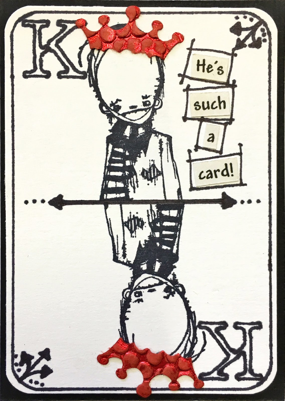
"Need a crown"... This one was coloured
using Brusho's.  You do need to blot the
Brusho off to get most of the water off
before you'll see the wax design.

Friday, May 6, 2016

POLISHED STONE

Polished Stone is a technique that has been around for quite a while and while using alcohol inks has made it a really simple technique, not everyone has all the beautiful colours of alcohol inks.  Most people do have some dye re-inkers though and these are what is used for this particular version, along with rubbing alcohol (which is like the Blending Solution that you use with the alcohol inks).

I have used the Ranger Distress Re-inkers because this is what I have most of but you could try out any other dye re-inkers you have on hand.  I always like to start with the lightest colour and generally use two contrasting colours first, like blue, green or yellow and orange and then use a darker third colour to build up interest and intensity.  Depending on what particular stamp or image you use, you place your colours on the card where you like.

One of the obstacles of working on an atc sized piece of card (2-1/2" x 3-1/2") is because the area is so small, you need to not be too heavy handed and totally cover your card with the darker colour as you'll lose the lighter effect of the first application.  You might want to try this technique on a larger greeting card size first to get an idea of how it blends etc before tackling the smaller atc card.  I used a cotton wool ball for application.

"Eternity"... 

"Little key"... 

"Heels"... 

"Pixie Dust"... (the sparkly bits on the wings
are Angelina Fibre cut and added onto 
Glossy Accents while still wet)