Tuesday, August 18, 2020

ACRYLIC INK ACCENTS

 Some time ago I bought some watercolour drawing inks and a glass dip pen as I loved the look of the various colours of inks.  Fast forward a few months and I found a couple of artists who were using acrylic drawing inks on top of alcohol inks.  I loved the contrast between the freestyle whispy background of the alcohol inks with the more solid lines that acrylic inks can create, without messing up the alcohol ink as acrylic ink has no solvent in it.  So the base of these are all alcohol inks with accents added using black, burnt umber or red acrylic ink applied with a skewer, a stylus or simply blown with a rubber puffer to create the spiky tendrils.  Love this technique!

"Rainbow of life"
(The birds are the acrylic ink accent)

"Little bit broken"
(The black tendrils are acrylic ink)

"Dog gins"
(I used a stylus to add the drop shapes 
with red acrylic ink)


"Furry"
(The branch is burnt umber and black acrylic ink and the weird 
shape down the bottom is a striped fluffy chenille
stem that is supposed to represent a caterpillar)


"5 Second rule"
(The tree and roots are burnt umber 
acrylic ink drawn with a skewer

"Not too late"
(Black acrylic ink was drawn across in 3 sections
and then a skewer was used to pull down
sections of it to create the vertical lines)

Tuesday, July 21, 2020

METALLIC WATERCOLOURS ON BLACK & WHITE

I have three sets of metallic watercolour paints (Gansi Tambi) as well as 50+ pots of Twinkling H2O's which are also watercolour paint.  These paints are solid and will activate when you spritz with a little water or use a water brush.  Because of this, they are very portable and you can leave the lids off them and they won't dry out.  The metallic watercolour paints work beautifully on black cardstock as well as white.  I have used plain black cardstock and white watercolour card for these samples.  Because plain cardstock isn't as water-friendly as watercolour card, you need to be mindful of how much water you use.  In some of the samples I have used the metallic watercolours purely as a wash over the background, others I have coloured the stamped images in.  The die-cut leaves in the 2nd sample are cut from a black piece of card that was painted with the watercolours as a wash, then die-cut.  Unfortunately, as hard as I tried, it's very hard to convey the shimmer that is in these samples.  Trust me, you'll just have to do some yourself and see how wonderful they can look.  I have embossed with white embossing powder before colouring and also stamped with black pigment ink and then clear-embossed (less chance of those stray black bits of embossing that way).

"Rule number 1"

"Feel the rain"

"Hum of bees"

"Inhale the future"
(The tree die-cut has also been made from
a piece of black card that was coloured with
green and gold metallic watercolour
paints as a wash before die-cutting)

"Life is short"

"OMG same"
(The raised centres of the flowers are made from
Ferrero Rocher chocolate gold wrappers, with
double-sided adhesive on the back for stability
and stick-factor, then punched out with a sun-
burst punch, then a little square of black foam
tape in the centre, then attached to the centre
of each flower.  Can you say:  fiddly???
I also used a baby wipe to wipe off some of
the metallic paints around the little man
and flowers.)

Tuesday, July 7, 2020

MICA TECHNIQUES

Mica is a product that has been around forever.  I remember buying some nearly 20 years ago and I still have some of it left.  Since then I have used several different types of Mica, from donut shapes to different colours of Mica through to Mica flakes.  The Mica I have used for this class is absolutely clear in colour, transparent and also flexible so it doesn't shatter the same way that my other Mica does.  Consequently, I used alcohol inks to add colour to it so it would look different from say, a piece of acetate (because that's exactly what it feels like!).  However, because this is Mica, it is heat resistant and you can emboss on it.  I even tried using the Distress Glaze Embossing Powder on it and it works beautifully as it just changes the colour of the Mica but also gives a nice bumpy sort of texture.  There's no sample of that here amongst these ones, I was just trying out all sorts of things to see what would work and what wouldn't.  Love that I can staple or brad these pieces on too.  I even die-cut a piece (the heart on the 2nd ATC) though that took a bit of hand-cutting too.  It made me want to do another class using the other ordinary Mica, though there is nothing ordinary about any Mica!  Love it all.  

"Plastic melts"

"No refunds"

"Aquaholic"

"Evil"
(Yes, you can even stamp on it with Black
Archival Ink and heat set with a heat gun)

"dos"
(I've been waiting for ages to use
this quote 😉)

"Take the leap"
(The leaf shape in brown is the Mica coloured
and with some clear embossing on it)

Finally, these last two are samples from last week's class, Embossed Waxed Backgrounds.

"Zombies"

"Steampunk"

Tuesday, June 23, 2020

EMBOSSED WAXED BACKGROUNDS

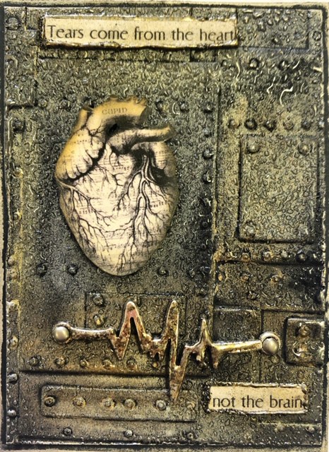
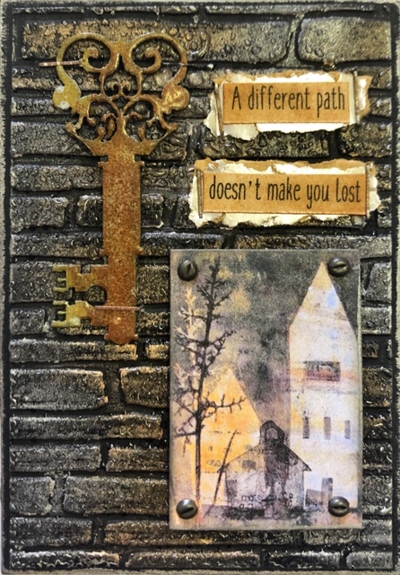
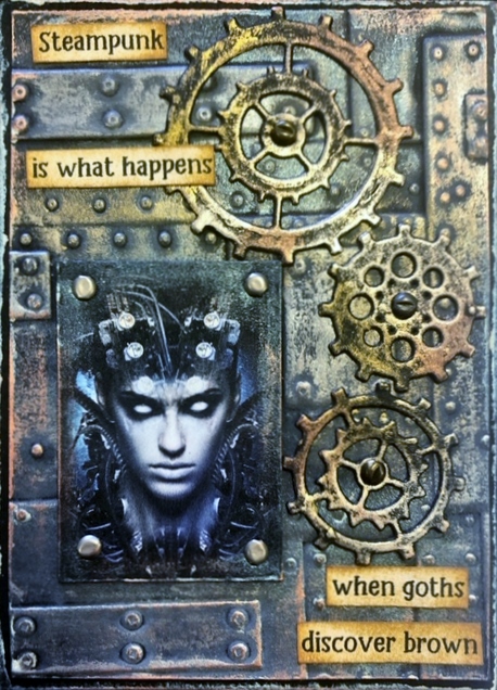
 This technique embraces the depth of the 3-D embossing folders that are available through the various companies now.  I've used plain black cardstock and only 3-D embossing folders for this technique, though you could try it with your normal embossing folders as well.  A trick I learnt was to lightly spritz with water one side of the card stock before running it through.  This relaxes the card stock and allows for the deep impressions without causing excessive cracking and tearing which can happen if you skip this step.  It's not a bad habit to get into when you're using your normal embossing folders too!  I followed up with some distress oxide ink as these will show up on dark card stock (stick with lighter colours though and don't expect a true colour representation!), then I applied the Art Alchemy Waxes from Finnabair as well as my old collection of Treasure Gold waxes.  These waxes show up really well on black and are a staple of many a mixed media/card maker/paper artist.

"The heart"
(This little folded 3-D heart from Sizzix is a test 
of your patience, but oh so worth it)

"Don't look back"

"Bitter"

"Aspire"
(The computer does enjoy fiddling with the 
tones and shades of metallics, rest-assured
all these silvers match)

"Selfie"
(The squiggly lines in her hair are made by using
the fine Distress Embossing Marker Pen, then
just clear embossing.  A neat effect!)

Tuesday, June 9, 2020

ALCOHOL INK ON TEXTURED FOIL

Everyone knows how well Alcohol Inks work on foil.  This substrate is also a foil, but it's not an intended art surface.  I noticed my hairdresser using a pre-cut foil product instead of the usual kitchen foil that she used to cut up for the foils in my hair.  I immediately thought it would be a perfect surface for alcohol inks and loved the bumpy texture it had.  I was right!  It's a wonderful surface after it is applied to a piece of card stock for stability.  The translucence of the alcohol inks and the texture creates a very different look to traditional Yupo or adhesive foil that I've used before.  If your hairdresser uses this type of foil, ask for a couple of pieces to give it a try and I'm sure you'll be convinced too. 

"Find your wings"
(I coloured a scrap of Yupo with mustard & grey
alcohol ink and then die-cut the leaves out to
get the leaves for the branch)

"Scenic Route"
(The clouds up the top are a little of Snowcap (white)
alcohol ink mixed with 99% alcohol in a 
needle-nose bottle)

"What you allow"

"If not now"

"Leap of faith"

"Dragon"
(I used the Alcohol Pearls on this background.
They are not quite as translucent as the normal
alcohol inks but still work ok)

Finally, this is another one from last fortnight's class, Focal Stamping & Brusho Background.

"Fungi"

Tuesday, May 26, 2020

FOCAL STAMPING ON BRUSHO BACKGROUND

It's back to class we go!  I'm so glad we can start our classes again as I've really missed the companionship of the girls in my ATC group.  I'll be easing them back into a creative mindset with a simple style of ATC's - choosing a focal stamp that is embossed onto a Brusho background.  I've been using my Versafine Clair ink pad in Nocturn (black) as it is a very dense, rich black pigment pad that works wonderfully with just a coat of clear embossing powder over the top to help the stamped focal image stand out on the bright backgrounds of the Brusho's.  I also used other powders besides Brusho's, these were Tonic Shimmer Powders, Cosmic Pixie Powders and Lindy's Stamp Gang Magical Shakers.  Any powdered pigment will work for these backgrounds.  Simply spray your watercolour card first with water, then sprinkle the colours on (very little is needed as they are very pigment-rich).  Add some more water if you have chunky bits and I just use my finger to blend areas together.  Dry with a low blow heat gun, then it's ready for stamping.
Don't forget, wash your hands and keep your physical distance.  😊

"Barrenness"

"Eraser"

"Fabulous called"
(my grand-daughter Zoe created this background
and also chose the stamps to use, as well as
the hat & glasses)

"Namast'ay"

"Rollercoaster"