Highly pigmented powders like Brushos, Cosmic Pixie Powders, Nuvo Shimmer Powders, Lindy's Magical Shakers etc have been around for a few years now and they are always a quick and easy way to create a background. You can use them as they are, just a few gentle shakes, spritz with water and you get wonderful explosions of colour, or you can spritz your watercolour card first with water and then add. You can also just mix a single colour by itself on a piece of acetate to create one colour and use that for painting your background or your stamped designs. I've used a few different ways to create these backgrounds, including bleaching out a stamped image and then re-colouring with the pigment powders!
"Soul food"
(background & leaf shape coloured with Brusho
& Lindy's Magical Shaker powder)

"Soar"
(background created with Lindy's Magical
Shakers, trees stamped and Twinklets Diamond Dust
under the trees for extra sparkle)

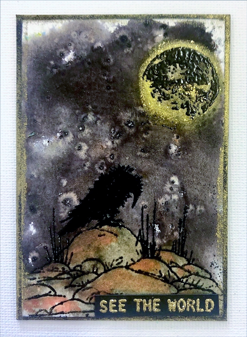
"What the flock?"
(background using black Brushos only, then
bleached the stamped birds and re-coloured
with Nuvo Shimmer Powders)

"Curiosities"
(background with Nuvo Shimmer Powders and
Cosmic Pixie Powders, stamped skulls bleached
and re-coloured with Nuvo Shimmer Powders)

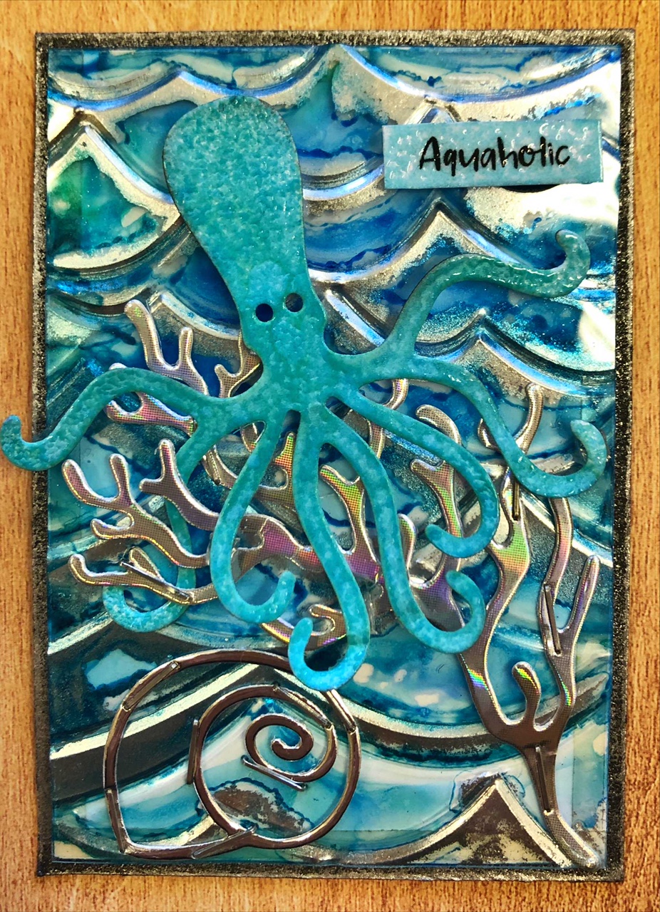
"If lost"
(background with Lindy's Magical Shakers &
Cosmic Pixie Powders, octopus stamped, embossed
and bleached)

"Wild side"
(background with Brushos and finger-painted
to blend, then Amsterdam Bronze paint applied
roughly on the bottom, overstamped with rocks
stamp and Amsterdam Pewter paint added. Tree
is JAC paper die-cut with brown foil applied)

"Let's party"
My granddaughter (7) wanted to do one herself
so this is her version of my What the flock? She used
my stamp positioner so stamping was easy, I did the
bleaching for her and showed her how to colour
the birds with the Nuvo Shimmer Powders. She's
going to gift it to a friend at a holiday park we
are going to next week. 🥰