Tuesday, February 15, 2022

INKED LANDSCAPES (ZOMBIES)

  You'll find my updated ATC Techniques List on a separate page at the top of my page directly under my banner, "ATC Technique List - Current & Previous".

I love any excuse to be able to use my liquid acrylic inks and the combination of acrylic inks and bleach gives wonderful effects. I have created a different effect using salt with fluid acrylic paint and rock salt but the bleach just takes it to the next level. Credit must go to Lydia from Splitcoaststampers for the specific acrylic ink/bleach technique. I must also blame her for my obsessive search for some Zombie stamps. So very glad I found them as they suit this style so well. 
Mainly black was used for this technique but as you can see from Kraken below, coloured acrylic inks will still work. However, you can't beat black for the moodiness that suits the zombie stamps perfectly! The Vegan Zombie background colour is a combination of Carbon Black and Prussian Blue (both Liquitex Acrylic Inks). The addition of gel pens creates easy highlights where needed. The shark fin was made by cutting a small fin shape from craft foam and attaching it to a piece of acetate and used as a stamp. What's the saying about necessity being the mother of invention? 😉

"Vegan Zombie"


"Kraken"


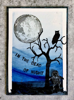
"Middle of the night"


"Thrilled to meat you"


"Dead people"


"Grab a bite"


Wednesday, February 2, 2022

FAUX WATERCOLOUR DIP

 You'll find my updated ATC Techniques List on a separate page at the top of my page directly under my banner, "ATC Technique List - Current & Previous".

So begins another year of techniques for my atc classes. Over the holiday break, I've been dabbling with watercolours. I bought a few new watercolour paint sets and wanted to try out some different styles to see what would translate well onto the small size that is an atc (2½"x3½", or 63mm x 89mm). Sometimes I'll try out new techniques on card size backgrounds first to see if they will be able to be done on the smaller size, sometimes it works and sometimes it doesn't. 

This particular technique works quite well as it is basically a wash across the watercolour card getting darker as you go down. It's very hard to see in these pictures but the bottom edge is torn so it really soaks up the darker colour and creates a great contrast with the backing. Of course, like most of this type of work, it looks better in the flesh than on a flat screen. If you do nothing else this year, I encourage you to try out a new technique or style. You'll probably surprise yourself at how well you do! 


"Pause button"

"Imperfections"


"Not what they seem"


"Scenic Route"


"Jump in"


"Dead of night"

Book 27 cover
(20cm x 15cm, 8" x 6")