Thursday, August 22, 2019

EMBOSSED GLOSS STAMPING

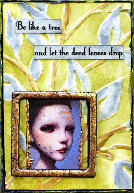
This technique combines a few of my favourite things, stamping, embossing and Nuvo Shimmer Powders (or Cosmic Pixie Powders/Brushos).  Because I was going to be using the Shimmer Powders with water, I needed to have the stamping done in Archival Ink instead of just reaching for my usual Distress Oxide Ink Pads.  I recently bought the 3 sets of the mini Archival Ink Pads in the Distress colours and I'm so glad I did!  They are wonderful colours as you can see below in the stamping.  These were stamped on gloss card, then after the stamped image had dried I spritzed on some water and added some of the Nuvo Shimmer Powder.  Next, I tapped off the excess water then dumped clear embossing powder over the whole thing.  No embossing ink was used, the water was enough to hold the clear embossing powder which I then heated to create the gorgeous glossy, speckly effect.  It turned out with a rough texture as some of the water had dried and the embossing powder wasn't stuck to the whole card, just sections.  The other thing I noticed was that the stamping seemed to create a resist type of effect too!

"Poke the dragon"...

"Figureoutable"...

"Edible"...

"Melts in your mouth"...

"Science puns"...

Tuesday, August 6, 2019

EMBOSSING FOLDER WATERCOLOURING

The use of embossing folders with the gorgeous colours of Distress Oxide Ink Pads is the basis for this fortnight's technique.  For this to work well, you need to use embossing folders that have a lot of open space on them, in other words, not a densely covered embossing folder but one that has only a few lines or a few solid areas.  The samples below will give you an idea of which type works best with this technique.  I added the colour directly from the Distress Oxide Pad onto the side of the embossing folder that has the recesses on it, so the side of the embossing folder that has the design raised on it is the side that has no colour.  Swipe the ink pad over the recessed side, spritz lightly with water, place your card inside and then run through a Big Shot or equivalent.  
You should have your design stay mainly white with the background area coloured.  If you use too much water it will run into the recesses and colour those too, try and avoid that.  I then used an aqua pen and used a little colour from the ink pad to colour in the design how I wanted.  Maybe you need to fill in an area that was a bit dry, or like the mountain scene below, I added a grey shadow beneath the mountain impressions.  On the 3rd one below, Dead Leaves, I used Iced Spruce to colour in the leaves and Gathered Twigs to do the stems.  The background on this one was Peeled Paint.  

"Fear of falling"...

"On my way"...

"Dead leaves"...

"Aquaholic"...

"Magic"...

"Wildflower"...