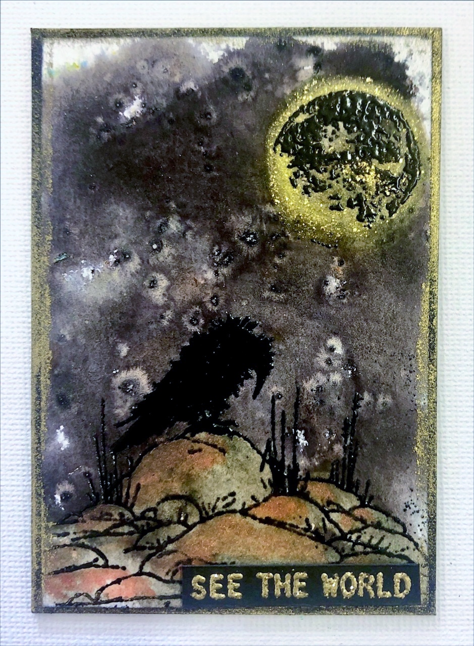
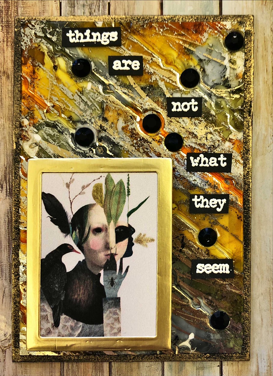
This technique embraces the depth of the 3-D embossing folders that are available through the various companies now. I've used plain black cardstock and only 3-D embossing folders for this technique, though you could try it with your normal embossing folders as well. A trick I learnt was to lightly spritz with water one side of the card stock before running it through. This relaxes the card stock and allows for the deep impressions without causing excessive cracking and tearing which can happen if you skip this step. It's not a bad habit to get into when you're using your normal embossing folders too! I followed up with some distress oxide ink as these will show up on dark card stock (stick with lighter colours though and don't expect a true colour representation!), then I applied the Art Alchemy Waxes from Finnabair as well as my old collection of Treasure Gold waxes. These waxes show up really well on black and are a staple of many a mixed media/card maker/paper artist.
"The heart"
(This little folded 3-D heart from Sizzix is a test
of your patience, but oh so worth it)
"Don't look back"
"Bitter"
"Aspire"
(The computer does enjoy fiddling with the
tones and shades of metallics, rest-assured
all these silvers match)
"Selfie"
(The squiggly lines in her hair are made by using
the fine Distress Embossing Marker Pen, then
just clear embossing. A neat effect!)