Thursday, August 22, 2019

EMBOSSED GLOSS STAMPING

This technique combines a few of my favourite things, stamping, embossing and Nuvo Shimmer Powders (or Cosmic Pixie Powders/Brushos).  Because I was going to be using the Shimmer Powders with water, I needed to have the stamping done in Archival Ink instead of just reaching for my usual Distress Oxide Ink Pads.  I recently bought the 3 sets of the mini Archival Ink Pads in the Distress colours and I'm so glad I did!  They are wonderful colours as you can see below in the stamping.  These were stamped on gloss card, then after the stamped image had dried I spritzed on some water and added some of the Nuvo Shimmer Powder.  Next, I tapped off the excess water then dumped clear embossing powder over the whole thing.  No embossing ink was used, the water was enough to hold the clear embossing powder which I then heated to create the gorgeous glossy, speckly effect.  It turned out with a rough texture as some of the water had dried and the embossing powder wasn't stuck to the whole card, just sections.  The other thing I noticed was that the stamping seemed to create a resist type of effect too!

"Poke the dragon"...

"Figureoutable"...

"Edible"...

"Melts in your mouth"...

"Science puns"...

Tuesday, August 6, 2019

EMBOSSING FOLDER WATERCOLOURING

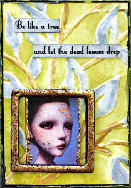
The use of embossing folders with the gorgeous colours of Distress Oxide Ink Pads is the basis for this fortnight's technique.  For this to work well, you need to use embossing folders that have a lot of open space on them, in other words, not a densely covered embossing folder but one that has only a few lines or a few solid areas.  The samples below will give you an idea of which type works best with this technique.  I added the colour directly from the Distress Oxide Pad onto the side of the embossing folder that has the recesses on it, so the side of the embossing folder that has the design raised on it is the side that has no colour.  Swipe the ink pad over the recessed side, spritz lightly with water, place your card inside and then run through a Big Shot or equivalent.  
You should have your design stay mainly white with the background area coloured.  If you use too much water it will run into the recesses and colour those too, try and avoid that.  I then used an aqua pen and used a little colour from the ink pad to colour in the design how I wanted.  Maybe you need to fill in an area that was a bit dry, or like the mountain scene below, I added a grey shadow beneath the mountain impressions.  On the 3rd one below, Dead Leaves, I used Iced Spruce to colour in the leaves and Gathered Twigs to do the stems.  The background on this one was Peeled Paint.  

"Fear of falling"...

"On my way"...

"Dead leaves"...

"Aquaholic"...

"Magic"...

"Wildflower"...

Monday, July 22, 2019

MAGIC ERASER & ALCOHOL INKS

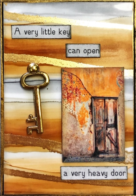
I recently purchased some new alcohol inks from Riot Art here in Australia.  The brand is Paper Mill and all the samples shown below are made using these inks only.  Ranger is my normal alcohol ink go-to, but I wanted to try these ones out.  I have 20 colours (think that's all that is available) and they are very dense in colour and gorgeous!  Of course, you can use either blending solution or, as I do, 91% alcohol to dilute them down.  For this class, I wanted to use a different applicator that I had read about being used and was impressed with how it works.  The samples below with the stripey look to them is just using this applicator.  What is it?  It's a Magic Eraser!  Don't pay a lot for them from the supermarket, go to one of the cheap stores (Reject Shop, or Red Dot or similar) and buy a pack for only a few dollars.  Cut a piece off, drop on a drop of a couple of different colours, add a little alcohol (or blending solution) and swipe on.  This is how you get the striped effect.  The other ones I have blobbed it onto the card base (I used both Photo Paper and Yupo) like you would with your normal felt.  The alcohol doesn't soak in too much to the sponge and I found by doing a double size of the card (so 5" x 7"), it was easier to control the stripes.  As shown by the first and last card, these were both done at the same time.  The gold that you can see is Pinata Brass or Pinata Gold that has either just been applied directly from a tiny needle-nose bottle, or added and then a little 91% alcohol on top to get it to blend and move around.

"Heavy door"...

"Up at the stars"...

"Escape the ordinary"...

"Seas the day"...

"Join Nasa"...

"Hang on"...

Friday, July 12, 2019

SHAVING FOAM SPARKLE

Thus begins Technique Book #22.  Years ago we used shaving foam to create a marbled background (a great technique to re-visit by the way).  This technique is also using shaving foam but it is used in conjunction with Distress Oxide Inks.  I stumbled across this technique while trawling YouTube video's and had a play around with it to get it to work on the smaller size of ATC's, rather than on a card front.  The application of Distress Oxide to a small acrylic block, then a small swipe of shaving foam, then swipe that across your white card stock results in a messy, grungy style of colour application.  The addition of embossing in a couple of colours through the centre that has been left white helps to tie it all together.  I love how many ways you can use embossing powder, as a focus or feature, or as part of the background.  

This is my cover.  It's 20cm x 15cm (or 8" x 6").
The tree and owl are die-cuts, the skull design across the
bottom is a stamp and the net stuff up the top is some
Halloween fabric that I bought when it was on
clearance last year in November.  

"Terrors"...
(Both the bird & fence are
embossed with Black UTEE)

"Dead Fish"...
(The silver up the top is another fabric.
Check the dance section at your local
fabric store for what can be used on
ATC's and cards!)

"Scenic Route"...
(Tree, deer, rabbit & eagle
are all die-cuts.  The gold ones
are cut from a gold metallic paper pad
from K-Mart!)

"Feel the rain"...
(The 3 branches are all embossed with
Black UTEE.)

"Sparkle"...
(Gold leaf shape is also die-cut from the same
metallic paper from K-Mart.)


Finally, another sample from my previous class, Enamel Backgrounds.
"Tangled"...
(The bat up the top is made from some chopped up bits of
black glue stick that have been put into a silicon bat mould,
then heated.  Because the mould is silicon, the heat-gun doesn't
affect it and the glue dries quickly.  It's been rubbed over
with silver and gold metallic paint to bring out the details.)

Tuesday, June 25, 2019

ENAMEL BACKGROUNDS

This background is a combination of painted cardstock, clear UTEE (Ultra Thick Embossing Enamel) and black acrylic paint.  The colour that you see showing through is the initial paint colour that is applied to the card stock.  Then clear UTEE is applied all over, some of the UTEE is brushed off (into a bin) and then heated.  Black paint is then applied all over, let sit for a few minutes to dry slightly, then wipe off with a combination of dry paper towels and a baby wipe (if you wish to wipe more of the black off).  The black settles into the un-embossed areas creating the look of pitted enamel.

"End Task"...

"Face your problems"...

"No desire"...

"Birthstone"...

"Pause"...

Tuesday, June 11, 2019

PEARL ALCOHOL INKS

Alcohol Inks are one of my favourite mediums.  There are so many different surfaces they can be used on  -  Yupo, Gloss Card, Black Gloss Card, Silver Mirror Card, certain Photo Papers, Acetate, Glass, virtually any non-porous surface.  For this class, I wanted to test the Pearl Alcohol Inks with the same substrates.  The Pearls don't play nicely with alcohol (91%) which is what I use with my normal Alcohol Inks, they require the Blending Solution to get them to spread and not go granular and clumpy.  But, I have found that the Pearls do work on Neenah card stock, which is a porous surface!  You don't get the flowy blended look that you do on non-porous surfaces, but because the Pearls have the sheen in them, that actually shows up on the white Neenah card stock.  My sample below, "Results", is on Neenah.  Unfortunately, once again the computer doesn't show the shimmer of the alcohol ink but if you have some, give it a try on plain white card stock.  The shimmer is beautiful!

"Become"...
(Kirkland Photo Paper, a combo of normal
alcohol ink & Pearl, a piece of
Mica has been added over the picture)

"Hug a tree"...
(Black gloss card, Pearl alcohol inks only, with 
Posca white & black markers for the
trunks on the trees)

"If lost"...
(Yupo, Pearl alcohol inks only)

"Live in colour"...
(Kirkland Photo Paper, Pearl
alcohol inks only)

"Results"...
(Neenah, Pearl alcohol inks only)

Friday, May 31, 2019

EMBOSSED FAUX METALLIC PAPER

This technique takes advantage of the beautiful effects of the 3-d embossing folders that are available from various companies.  I have used both Sizzix and We Are Memory Keepers embossing folders, as well as ordinary embossing folders (meaning, not 3-d) and these all look wonderful!  The 3-d just adds a little extra depth to the backgrounds.  I have used Distress Oxide Ink Pads with sponges to lay down a base layer of colour, then working quickly, added Perfect Pearls over the top before the ink totally dries.  Spritz the back of the paper to allow it to stretch a little, then run through a Big Shot (or similar) with an embossing folder.  Take care which side you emboss as you want the colour to be on the raised-up side.  I also found the Perfect Pearls can brush off on your fingers so after adding the Pearls, but before running through the folder, I sprayed each background with a fixative to "set" the Perfect Pearls. I found the Perfect Pearl in white, which funnily enough is called Pearl, works the best.

"Shut up"...
(I love this colour combination, Hickory Smoke, Sprinkled
Sugar then Victorian Velvet on the bottom with Pearl Perfect Pearls)

"Poor Decision"...
(For this background, I used Washi Tape to mask off the edges of
the background to give a white border effect, 
then I used Fossilised Amber Distress Oxide with a Gold Perfect
Pearl over the top.  The card base is white but I used Pumice Stone
to lightly sponge over the top to bring out the detail of the embossing folder)

"Life is soup"...

"Dream in colours"...

"Contoured"...
(This one is a 6" square embossing folder that is not
3-d but still came up beautifully.  Tumbled Glass
and Sprinkled Sugar were the base colours with
Pearl Perfect Pearl over the top)

"Foolish Mortals"...
(Hickory Smoke is the base colour with
Pearl Perfect Pearls on top)