Tuesday, July 20, 2021

IRIDESCENT/INTERFERENCE PAINTS

 Iridescent and Interference paints work beautifully on black gloss card stock and create stunning die-cut shapes.  You can do these similar black gloss cards (or plain black cards) with Pearlised paints or Colour Shift paints.  The trick to making the most of these paints is to apply them very lightly and now allow them to build up too thick as it will show up with a white caste rather than the beautiful colours that are contained in the paint.  I use a fan brush to apply the whispy looking aurora borealis effect on some of the samples below as the paint won't clump on a fan brush like it does on a normal paintbrush.  Always work with your fan brush dry as well so you don't dilute the paint with water. You can also apply some streaks of colour to a scrap piece of black card (gloss or plain card), then die-cut shapes from these, the insect wings done this way work particularly well, see "Code" sample below as an example of wings created with this technique.  Another way to apply as shown in "I Don't Care" and "Life Looks Better" is to apply a few dabs of paint onto a piece of acetate, then place the acetate paint side down onto your black background.  Gently smoosh the paint around to spread it and lift the acetate up.  It will create little peaks and striations in the paint and produces a colourful background.

"Be a cactus"


"Code"


"I don't care"


"Strange"


"Smiles of nature"


"Life looks better"


"All your heart"

Tuesday, June 22, 2021

EVERYTHING WATERCOLOUR

It's been a while since we've used watercolours and in this class, we'll be creating both the background as well as the die-cuts with watercolour paper and either palette or liquid watercolours.  Each time I have a play with watercolours I remember how much fun it is to watch the colours bleed and blend into the next colour and the wet on wet technique is so good for this.  It means starting with a wet background (just wet with water) and then adding watercolour to the wet areas to get it to blend and spread.  Of course, you can use watercolours on a dry background and paint with them, then spritz if you like and this will create a different effect.  I certainly don't profess to be a watercolourist at all, but this medium's very nature means it can be a very loose style of colouring. 

"Planet B"


"Negative"


"Load Aim Fire"


"Fly High"


"Chaos"


"Bombdiggity"

Tuesday, June 8, 2021

WATERLESS WRINKLE BACKGROUND

Wrinkle techniques are a simple way to create a quick background that can be used just as a backing piece, or used to die-cut a shape from.  Normally with wrinkle backgrounds, you would scrunch a piece of plastic wrap (like Glad Wrap) onto a very wet surface that has inks, watercolours or alcohol inks onto it and then letting it sit until the underneath substrate totally dries.  This technique however is very quick and mess-free as it uses no water whatsoever.  We'll still be using the plastic wrap but we will also be using a Gelli Plate as well.  You can do this with just one colour of ink (I used Distress Oxide Ink Pads), or a couple of colours.  I even sprayed one of my pieces with the Distress Mica Spray first before doing the wrinkle technique (Grim outside) so it has a gorgeous bronze-coloured shimmer to the background.

"Organically grown" 


"Grim outside"


"Nothing changes"


"Let it hurt"


"Wander"


"Pray prey"
(I cut the trees from a piece of the wrinkle
background and placed over a Gelli Printed
background from a previous class.)

Tuesday, May 25, 2021

PRESS'N SEAL TECHNIQUES

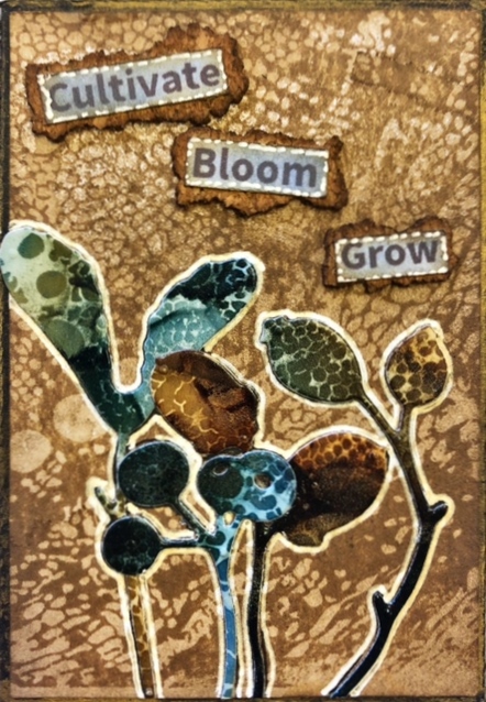
 Layering several die-cuts over the top of each other in a pleasing composition can be fraught with problems, until the discovery of Press'n Seal.  Fortunately, this is now available in Australia at Costco as none of the other grocery stores here carry it.  I have found it is also perfect for placing down fiddly and intricate die-cuts, especially if you have cut it out of thin paper, like metallic paper.  Especially if you have added your double-sided sheet to the back because when you peel off that release paper, the die-cut just wants to fold up on itself and stick together.  By placing a piece of Press'n Seal over the top before pulling off the release paper, you have much greater control over placement on your background.  You'll see I have a bit of a floral theme going on here.  The main dies I have that can be layered are the floral/weed/leaf dies but luckily these work perfectly.  This technique however will work with whatever die-cuts you choose to use.

"Cultivate"


"Bloom"


"Specimen"
(The last atc (Season) has the inner
removed pieces of this die-cut used
in a plain shimmer background. This
will work with any die that has pieces
that can be removed and still create a
recognisable shape.)


"Beautiful things"


"Golden Soul"


"Season"
(The inner part of this leaf is from the 
Beautiful things atc above.  By cutting
the leaf shape from both an alcohol ink
piece and a gold metallic piece, you can
interchange them to create two separate pieces.)

Tuesday, May 11, 2021

DIE-CUT STENCILLING

 I think it's important to try and get as much use out of your chosen products as you can, and in that vein, this technique utilises die-cut shapes and the off-cut waste that you'd normally discard, by using these pieces as masks.  I have used Distress Oxide Inks for all of these samples as I find it to be a more opaque colour. Some die-cut shapes work better than others and sometimes you need to insert the die-cut shape and sponge over that as well as the original outside shape to depict the details.  The two bug atc's below are the perfect example of this.  If you simply used the off-cut waste to create your design, you would just have a big blank outline of a bug.  But by placing the die back inside the outside waste and sponging a darker colour, you'll get all the detail that you miss in the first colour. Both of the bugs also have highlights in Glossy Accents.  I also used some grey markers to create some depth and shadow, mainly noticeable in the windows on the first act and then around the gravestones on the third one.  Another trick is to use a Mono Sand Eraser to gently erase away some of the colours to imitate the light source. You can see this effect, just under the moon in the first one and also around the ghost and the moon in the last atc. Be careful to not scratch away the card!

"Later"


"Easily distracted"


"In memory"


"What the flock?"


"Two weevils"


"No rest"

Tuesday, April 27, 2021

EMBOSSED LEAFING FLAKE

 Black gloss card can be used for various techniques and it works really well for this particular one, along with the addition of leafing flakes.  There are a few colours available of leafing flake (also called gilding flakes) and of course, you can mix 2 or 3 colours together to create your own colour combo's.  I used a Zig glue pen to go over the raised (or recessed) embossed design on the black gloss card which means you can choose which areas to highlight and which ones to leave black.  Apologies for the variations in the black gloss card.  It can be really difficult to capture the depth of the black background compared to the shine of the leafing flakes.  Try this technique out for yourself to see how great it looks in real life.  It'd make a great card background!

"Oxygen"


"Journey"


"Anty bodies"
(I've been wanting to use this
quote for ages.  😏)


"Ginfinity"


"Key"


"Warrior"


Tuesday, April 13, 2021

Mercury Glass

 I have always loved the look of Mercury Glass and this particular technique was inspired by both Seth Apter (an amazing mixed media artist that is renowned for his backgrounds) as well as a couple of other Youtube video's and also home decor blogs.  With this technique, you need to be careful about how busy the background is as a busy background will fight with the mercury glass images so they need to be fairly neutral or you can create the whole background as mercury glass and then add to that.  There are a few steps to create this and I have played around with various products to get these effects so I'd suggest checking with Google for your chosen method if you want to replicate it. 

"Focus"
(The seed pods and strip down the bottom
have been cut from the mercury glass technique)


"Under Water"
(The fish skeleton and light bulbs are
from the mercury glass.  I love how dimensional
Ranger Liquid Pearls are for creating the light
bulb cords and the edging around the words.)


"Too many tabs"
(The whole background is the mercury glass.
The little dots are made with the Molotow
Chrome Pen.)


"Chaos"
(Nuts and bolts etc are die-cut from the
mercury glass.)


"Take flight" close-up
(Showing the depth of the mountains which
is created by using layers of foam tape.)


"Take flight"


"Wings"
(The mercury glass was applied to a thin piece
of card stock and then used to create the
faceted heart die by Tim Holtz.)
"