Tuesday, June 25, 2019

ENAMEL BACKGROUNDS

This background is a combination of painted cardstock, clear UTEE (Ultra Thick Embossing Enamel) and black acrylic paint.  The colour that you see showing through is the initial paint colour that is applied to the card stock.  Then clear UTEE is applied all over, some of the UTEE is brushed off (into a bin) and then heated.  Black paint is then applied all over, let sit for a few minutes to dry slightly, then wipe off with a combination of dry paper towels and a baby wipe (if you wish to wipe more of the black off).  The black settles into the un-embossed areas creating the look of pitted enamel.

"End Task"...

"Face your problems"...

"No desire"...

"Birthstone"...

"Pause"...

Tuesday, June 11, 2019

PEARL ALCOHOL INKS

Alcohol Inks are one of my favourite mediums.  There are so many different surfaces they can be used on  -  Yupo, Gloss Card, Black Gloss Card, Silver Mirror Card, certain Photo Papers, Acetate, Glass, virtually any non-porous surface.  For this class, I wanted to test the Pearl Alcohol Inks with the same substrates.  The Pearls don't play nicely with alcohol (91%) which is what I use with my normal Alcohol Inks, they require the Blending Solution to get them to spread and not go granular and clumpy.  But, I have found that the Pearls do work on Neenah card stock, which is a porous surface!  You don't get the flowy blended look that you do on non-porous surfaces, but because the Pearls have the sheen in them, that actually shows up on the white Neenah card stock.  My sample below, "Results", is on Neenah.  Unfortunately, once again the computer doesn't show the shimmer of the alcohol ink but if you have some, give it a try on plain white card stock.  The shimmer is beautiful!

"Become"...
(Kirkland Photo Paper, a combo of normal
alcohol ink & Pearl, a piece of
Mica has been added over the picture)

"Hug a tree"...
(Black gloss card, Pearl alcohol inks only, with 
Posca white & black markers for the
trunks on the trees)

"If lost"...
(Yupo, Pearl alcohol inks only)

"Live in colour"...
(Kirkland Photo Paper, Pearl
alcohol inks only)

"Results"...
(Neenah, Pearl alcohol inks only)

Friday, May 31, 2019

EMBOSSED FAUX METALLIC PAPER

This technique takes advantage of the beautiful effects of the 3-d embossing folders that are available from various companies.  I have used both Sizzix and We Are Memory Keepers embossing folders, as well as ordinary embossing folders (meaning, not 3-d) and these all look wonderful!  The 3-d just adds a little extra depth to the backgrounds.  I have used Distress Oxide Ink Pads with sponges to lay down a base layer of colour, then working quickly, added Perfect Pearls over the top before the ink totally dries.  Spritz the back of the paper to allow it to stretch a little, then run through a Big Shot (or similar) with an embossing folder.  Take care which side you emboss as you want the colour to be on the raised-up side.  I also found the Perfect Pearls can brush off on your fingers so after adding the Pearls, but before running through the folder, I sprayed each background with a fixative to "set" the Perfect Pearls. I found the Perfect Pearl in white, which funnily enough is called Pearl, works the best.

"Shut up"...
(I love this colour combination, Hickory Smoke, Sprinkled
Sugar then Victorian Velvet on the bottom with Pearl Perfect Pearls)

"Poor Decision"...
(For this background, I used Washi Tape to mask off the edges of
the background to give a white border effect, 
then I used Fossilised Amber Distress Oxide with a Gold Perfect
Pearl over the top.  The card base is white but I used Pumice Stone
to lightly sponge over the top to bring out the detail of the embossing folder)

"Life is soup"...

"Dream in colours"...

"Contoured"...
(This one is a 6" square embossing folder that is not
3-d but still came up beautifully.  Tumbled Glass
and Sprinkled Sugar were the base colours with
Pearl Perfect Pearl over the top)

"Foolish Mortals"...
(Hickory Smoke is the base colour with
Pearl Perfect Pearls on top)

Friday, May 17, 2019

BRUSHO RESIST

Resist techniques are always a favourite and can be used with almost any product that you can add colour with.  For these samples I used my white embossing powder to create the background, then used Brusho's, Cosmic Pixie Powder and Tonic Shimmer Powders to create the colour over the embossed images.  You can add the powder directly to the embossed images on white card, then spritz with water, or spritz with water first and then add the colour.  Alternatively, you can spritz some water on a scrap of acetate (or your craft mat), tap on some of the Brusho's (or similar), then place your embossed white paper into the Brusho's to get a more blended look with the colours.

"Furry"...

"Monday"...

"Drama"...

"Perfect"...

"Shhh"...

Tuesday, April 30, 2019

ACTION WOBBLE ATC'S

This technique is one that really needs to be seen in the flesh to appreciate how they move.  You can buy action wobbles but they are expensive and difficult to get in Australia, so I made my own.  Simply use craft wire (I used 26 gauge silver craft wire), cut about 30cm (or 12") and wrap it around a pencil.  Then cut this into little sections so they look like mini springs, about 4 coils in total.  Punch out two small circles using a hole punch, use double-sided tape (or sticky tape) to attach one of these circles to each end of the spring, then attach that to your image.  Remember to attach the spring central on your stamped image so it balances ok and make sure your stamped image is wide enough to hide the wobble.  Simple!  I like how they look on a white background with some stamping as the cut edges of the stamped image blends really well against the white background, as per "Memory" below.... though the backgrounds work well too.  😃


"Memory"...

"Lazy"...

"Esc"...

"Caged"...

"Bacteria"...
(I used some of the new Pearl Alcohol Inks on the 
background on this one and it's just on plain 
Neenah cardstock, not gloss or Yupo.  Love
the shimmer you can get with these!)

Tuesday, April 16, 2019

FAUX SHAKER #2

This is another version of Faux Shaker technique.  Last fortnight we framed an image, then stuck down the little embellishments that would be normally floating loose in a normal shaker style technique.  The biggest problem with the normal shaker technique is that you need to make sure that the little box that you create out of the foam sides is completely sealed all around so you don't lose your little embellishments.  The other issue I've found with that particular technique is the little bits can get stuck to the excess sticky on all 4 sides inside the little box.  
This technique still looks and acts like a shaker style, but without the hassle.  I used cellophane bags to encase an image.  You don't need to have the little bags exactly the same size as your image, as all you need to do is to place the image down on a piece of cellophane, wrap and tape 3 sides, then pour in your embellishments at the top, then fold and wrap the top piece.  Attach it to your background with some foam tape and you're good to go.  A tip, don't wrap the cellophane too tight as you want the bits to be able to move around freely (microbeads are absolutely the best for this technique!) and if you use other things like sequins, make sure they are flat shapes.


"Snap"...

"Stay weird"...

"Darkness"...

"Whimsy"...
"Cranky"...

"Curious"...

This is a final one from last fortnight, Faux Shaker #1, where we glued down the little embellishments so it looks like a shaker, but it's not.
"Ecstasy"...

Tuesday, April 2, 2019

FAUX SHAKER TECHNIQUE

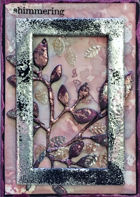
Shaker cards are notoriously fiddly, so this is a cheats version that very simple to do.  You're still using a frame (but it has no acetate), and you're still using little embellishments like sequins (but they're not loose).  As long as your frame is raised by using foam tape, your little sequins or the like are mainly glued down the bottom (with just a few scattered up higher) you have a very simple shaker technique that can be applied to atc's or just as easily to cards.  As you can see from the 2nd example, "Shimmering", the frame doesn't even need to go right to the edges and you can have your main focal piece peeking out from under it as this one is.

"Under water"...
(The background seaweed is a die-cut from JAC double-sided
paper and then foil pressed on.  The fishing line is Liquid Pearls in silver.)

"Shimmering"...
(The frame for this one has several coats of silver, black and 
a little pink embossing powder to give it a weathered look.)

"Somber"...
(Very simple style, and yes, somber can be
spelt either as somber or sombre... trust
me, it didn't look right to me either!)

"Before"...

 "Gene Pool"...
(The background is Soot Technique over a Distress Oxide
coloured gloss card.  The frame is a chipboard frame, coloured
with a black permanent marker, then dabbed into Tumbled
Glass Distress Oxide Ink that has been mixed 
with a little water, on a craft sheet.)

Finally, another one from last week's Messy Watercolour class.
"Dinner is Poured"...